The Magnet 0002 — Incredible Tiny Tokyo
Incredible tiny Tokyo, how to make the familiar feel new, a cheap way to improve your eyesight, my low sugar ice cream recipe, and more.

Welcome to the second issue of The Magnet! The response to the first issue was great, and I appreciate the kind words from everyone who tweeted about it and emailed me. (To find out why I launched The Magnet, click here.)
If you’re a non-paying subscriber, this issue, and the next one, will be free. After that, you’ll get occasional public posts but will miss out on a lot of exclusive subscriber content. If you like what you’ve seen so far, I hope you’ll subscribe to support the creation of this newsletter. For a limited time, you can get The Magnet at a special introductory rate by clicking the button below:
And now, on with the issue!
WORK OF WONDER
One man’s quest to recreate Tokyo at 1:20 scale

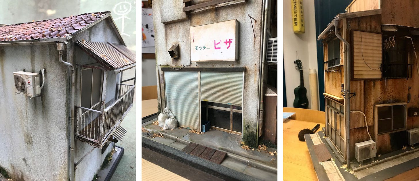
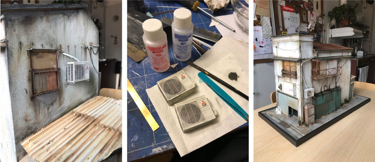
Last week I wrote about tiny comic books. This week I'm writing about tiny buildings. I promise I won’t always write about tiny things, but once you see these photos of Christopher Robin Nordstrom’s ultra-realistic scratch-built scale replicas of Tokyo’s buildings, and visit his TokyoBuild Instagram, I think you’ll understand why I couldn't resist sharing them with you.
Christopher Robin (“yes, I’m named after the boy in Winnie the Pooh”) was born on the southern island of Stockholm, Sweden, called Södermalm, and lives there today with his wife and three children. He has an education in fine arts and furniture design and has worked as a designer for companies such as Ikea and H&M.
Christopher kindly agreed to answer my questions about his awe-inspiring work:
How did you get interested in making miniature models, especially of Tokyo?
I have wanted to go to Tokyo ever since I was 12 years old. If you are the least interested in eastern pop culture, Tokyo is the one place you dream to go to. A couple of years ago I had the opportunity to travel to Tokyo for work, and it was everything and more that I had dreamt of. Such an amazing place! I was surprised by how “small” the city felt even though it is one of the world’s biggest cities. I was struck by all the small streets with small worn houses with heavy patina. I had never seen houses with so much soul. The houses were like a part of the families who live and work there.
When I got home I needed something to do, a project I could do at the kitchen table. (I had a bad habit of getting stuck in front of Netflix every night, nothing bad about Netflix but you get what I mean.) So I took on the challenge to try to capture the vibe and soul of the Tokyo houses I saw on my trip in miniatures.

How did you learn how to make miniature buildings?
I hadn’t built miniatures before, just a couple of warplanes in my early teens. But otherwise nothing small-scaled. So I more or less had to learn everything from the beginning. Watching lots of YouTube and just learning by doing. It has been a steep learning curve. When I studied fine arts I learned to use my eyes, learned how to really look. And that has helped me in creating these miniatures. Looking at the buildings and then doing everything in my power to replicate what I see in scale 1:20. And don’t try to compromise. A kind of straightforward tactic.
Could you briefly go through the process of making a model and the materials you use? How do you "age" the materials?
Since I don’t live in Tokyo, I use Google Street View to find the houses I want to build. Like taking a digital walk in Tokyo. When I have found a house I want to build, I screen grab and make plans using Photoshop and Illustrator.
Then I build a base, often in MDF [medium-density fibreboard] board. I use whatever materials that suit the build I’m doing — brass, plastic, wood, etc. I love using brass that I can solder and photo-etch. You can get amazing details using the photo etching technique. I also cast in plastic and sometimes I laser cut and 3D print.
When I start a new build I often want to add a new process that I haven’t used before just to learn something new. My latest project is to use hide glue. Same as the old Renaissance painters. A fantastic glue if you ignore that the apartment smells like dog bones…
Weathering and aging the builds are really close to doing a painting. I use oil paint and dry pastels, slowly adding grime, rust, etc. Almost like painting the building’s history. A really fun process, but easy to overdo, so you have to take it easy.
I have chosen to build in 1:20 scale because nothing is available off the shelf in that scale, and that forces me to build everything from scratch.

What is something you'd like to make that you haven't made yet?
Hmm, good question. I would love to build a Koban police box (small local police office) and have the police officers pose with the model in front of the real Koban. And I would also want to build a bigger office style building, and a ramen restaurant, and a lighthouse from Yokohama. And I would also want to build a model when I’m in Tokyo using only Japanese materials and tools. So many models I wanna build, haha…
Join Christopher’s TokyoBuild Patreon for exclusive content and build notes.
NEWSLETTER HIGHLIGHTS
Jack Druce is an Australian comedian and often appears on prime time television. As you might expect, his newsletter is funny and — like all good comedy — also true and thought-changing. For example, I’m not a fan of pro sports, but his 13 Aug issue helped me understand why sports can be about more than just physical competitions:
The Baseball player who felt bad for being mean to his bat
“I've surprised myself by consuming a lot of baseball content during the lockdown. Never been a fan of the sport, but I listened to the Moneyball audiobook and loved it. Then I watched a documentary where a Japanese player had a hard time in batting practice and threw his bat on the ground. Afterward, he was so ashamed of throwing the bat, that he took it back to his hotel room and tucked it into his bed and then wrote a letter of apology to the bat manufacturer. That is such a clear distillation of the type of thing that I like. Sports and agression mixed with tenderness and eccentricity.”
Joshua Schachter created well-known web tools Delicious, GeoURL, and Memepool. His newsletter Wheelhouse is a treasure trove of recommendations of tools and workshop tips. The 20 Nov 2019 issue is dedicated to different kinds of adhesive tape and what they’re good for:
Nonstick surface-grip tape
"This grippy tape turns anything into non-skid. It has rubber adhesive, fiberglass body, and silicone grippy surface. If you put it on the back of a magnet, it will no longer slide across a smooth steel surface. Rubber bumpers and other rubber feet are good for lots of things, but when you don’t want or need added height, or when you have a weirdly shaped thing, this tape is amazing.” — @1lenore
Of course, McMaster has an entire department of both non-slip and ultra-slippery tapes.
Journalist Rob Walker is author of the book, The Art of Noticing: 131 Ways to Spark Creativity, Find Inspiration, and Discover Joy in the Everyday. He’s got a newsletter with the same name. I highly recommend them both. In his 10 Aug issue, Rob offers a list of methods to how to make the familiar seem new:
Breaking the habituation habit
Identify a human-made miracle in your life you’ve come to take for granted.
Same for a feature of the natural world: pick out some miracle of nature you encounter so often you’ve stopped noticing it.
Consider a person in your life (IRL or digitally), whether close or a familiar stranger or anywhere in between, that you enjoy but have come to take for granted.
Now go the other way: What’s a problem or annoyance you’ve gotten habituated to — but that can be solved? How could you solve it?
Think of something you’ve never habituated to — a thing you love that everyone else takes for granted (or even dislikes). Duckworth mentions her love of wall-to-wall carpeting. Which I find crazy, but that’s the point: identify something unique to you.
Finally, identify some thing or activity that you now take for granted that you’d be sad to lose if it were abruptly taken away from you.
RECIPE
Low sugar vanilla chocolate chip ice cream

In the first issue of The Magnet, I shared my recipe for very low-carb almond flour bread. It calls for 3 egg whites. When I make this bread, I usually make a double batch, which leaves me with 6 egg yolks. I didn't want to waste them, though, and I knew ice cream often uses egg yolks, so I decided to try making ice cream. I also had an old, inexpensive Cuisinart ice cream maker that I hadn't used in at least a decade. (I stopped using it because I didn't think it made very good ice cream. It was too soft.)
I looked around for recipes and found this one in The New York Times. It looked easy to make — the only ingredients were cream, milk, sugar, salt, vanilla, and, most importantly, 6 egg yolks.
For the past four weekends, I’ve been experimenting with the ingredients and the churning time, and last weekend I finally made ice cream I love enough to share the recipe for.
The game-changer was how long I ran the ice-cream maker. The first time I let it run too long and it was softer and lighter than I wanted. The second time I let it run even longer, thinking that would fix the problem, but it was even lighter than my first attempt. I went online and learned that over-churning is called overrun, which introduces too much air into the ice cream. (This Ice Cream Geekery page has good information about overrun). I overcorrected on the third attempt by not running the mixer long enough. As a result, very little air got into the ice cream, and after I put it in the freezer to cool, it was almost too hard to scoop out. On my fourth try, I kept a close eye on the ice cream as it was being mixed, and as soon as it started to noticeably rise and look stiff, I turned off the mixer, scooped the ice cream into a plastic tub, and put it into the freezer for a couple of hours. When I took it out and sampled it, I couldn't believe how good it was! Not too soft, not too hard, not too fluffy, and with the right amount of chewiness. It tasted and had the same mouthfeel as Häagen-Dazs Vanilla Chocolate Chip, which is my favorite store-brand ice cream. The only difference is that the batch I made had less sugar, which is how I wanted it.
If you want to try this and don’t have a mixer, you can get the latest model of the one I have. Here’s the Cuisinart product page. It’s about $70.
Ingredients:
1 cup heavy cream
2 cups half-and-half
6 egg yolks
A handful of dark chocolate chips, chopped into large chunks
⅛ tsp salt
1 tbs vanilla extract
5-6 tbs sugar (I like it with 4 tbs, the rest of my family likes 6. The NYT recipe calls for ⅔ cup, or 10-⅔ tbs, which is way too sweet for me.)
Instructions:
Make sure the ice cream maker freezer bowl has been in the freezer for at least 12 hours before proceeding.
Put everything except the chocolate chunks into a pot and gently heat to a simmer for 5 minutes.
Pour the mixture through a strainer into a jar or bowl. The strainer will catch the bits of cooked egg whites that were stuck to the yolks (I like to eat these bits as a pre-treat).
Put the strained mixture in the refrigerator for at least 2 hours (I let it sit in the fridge overnight).
Set up the ice cream maker and pour in the mixture. Turn it on, and check the progress after it runs for 10 minutes. Then check every 5 minutes. Once the ice cream starts to rise noticeably, turn off the machine and use a silicone spoon or spatula to transfer the ice cream to a freezable container. (This video clip shows what the ice cream looks like when it’s mixed enough.)
Toss in the chocolate chunks and mix until they are evenly distributed.
Put the container in the freezer for at least 3 hours.
If you try this recipe, let me know how it goes by posting in the comments.
BIOHACKING
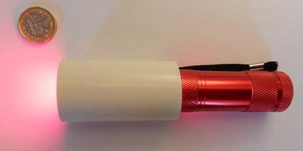
Staring at a $16 red flashlight improved eyesight in people over 40

This is the handheld LED flashlight used in the study. Credit: UCL
Exposing your eyes to deep red light for 3 minutes a day can “significantly improve declining eyesight,” reports University College London. Researchers at UCL first tested the eyesight of 24 volunteers between the age of 28 and 72. They sent them home with inexpensive flashlights that emitted deep red 670-nanometer wavelength light and instructed them to look into the light for 3 minutes a day for 2 weeks. The results? No change for young people, but those over 40 saw significant improvements in both cone (color) and rod (light detection) sensitivity.
Lead researcher Professor Glen Jeffery (UCL Institute of Ophthalmology):
“Our study shows that it is possible to significantly improve vision that has declined in aged individuals using simple brief exposures to light wavelengths that recharge the energy system that has declined in the retina cells, rather like re-charging a battery.
“The technology is simple and very safe, using a deep red light of a specific wavelength, that is absorbed by mitochondria in the retina that supply energy for cellular function.
“Our devices cost about £12 to make, so the technology is highly accessible to members of the public.”
The article notes, “These torches were produced for the study. There are currently no commercially available torches of the same specification.” A quick online search revealed several sources for inexpensive 670-nanometer wavelength LEDs as well as several subreddit discussions about DIY approaches. Don’t try anything like this before talking to your doctor, of course!
QUOTE
“Every kind of writing is good save that which bores.” — Voltaire, preface to L’Enfant prodigue (1736)
One time, when I was an associate editor at Wired, I received a manuscript for a story I’d assigned to a writer. I thought the piece was amazing, but the senior editor was upset because it wasn’t what we had asked for in the assignment letter. I tried unsuccessfully to convince her to run it anyway, because “the only thing that matters is if it's interesting or not, and this is interesting.” I was overruled, and rightly so, but when I recently came across Voltaire’s quote, it felt good to have a renowned person of letters understand where I was coming from.
Thanks for being an early subscriber to The Magnet. If you liked this issue please share it by clicking the button above.
The Magnet is written and produced by Mark Frauenfelder and edited by Carla Sinclair.
